
One of the nice things about blogging about financial investing is that it make me think more carefully about my investing activity. Being an analytical sort of person, I decided to take a good hard look at my returns in detail, and see what lessons I could draw from them.
For this post I’ve taken the portion of my portfolio which is readily trackable. This isn’t my entire investment portfolio but it is the majority of it, and it performs in line with the overall portfolio. This portion has been tracked in detail for many years, so it gives me an analytical data set that makes it very useful.
I’ve taken the investments which I had three years ago – on 1 July 2012 to be precise. I have 114 investments in this dataset, ranging from tiny individual shareholdings of under £1000 to a hefty ETF exposure into IUKD (iShares’ yield-orientated FTSE-350 ETF). By the end of the three year period, I had sold about half of these holdings. It is worth noting that my strategy and thinking has evolved significantly in the last three years; these days I would see less churn in the portfolio (and fewer small holdings).
I’ve then looked at what the average annual return that each investment obtained, over three years (from 1 July 2012 to 1 July 2015). Returns include the gain in value as well as any dividend income. This is a money-weighted calculation; if I tripled my exposure in 2014, then the 2014 returns will carry 3x the weight of the 2013 returns; if I sold the position on 1 Jan 2013 then the returns will be the six month returns (from 1 July ’12 to 1 Jan ’13), annualised. The actual calculation is done for me by my tracking software.
Overall, over this three year period, results were as follows:
- FTSE-100 has returned about 10% per year (can anybody point me at a definitive source for this data?). The index rose from 5600 to 6700 (about 21%) in that period; dividends made up the rest.
- FTSE All share has returned about 11.5% per year.
- S&P 500 has returned about 17% per year.
- The Barclays Aggregate Bond index has returned about 2% per year.
- My tracked investments have averaged about 11.5% per year, according to my tracking software. This is very close to the returns I’ve posted on my entire investment portfolio over the last three years.
The graph below maps each of my holdings against its three year average annual return (normalised as described above).
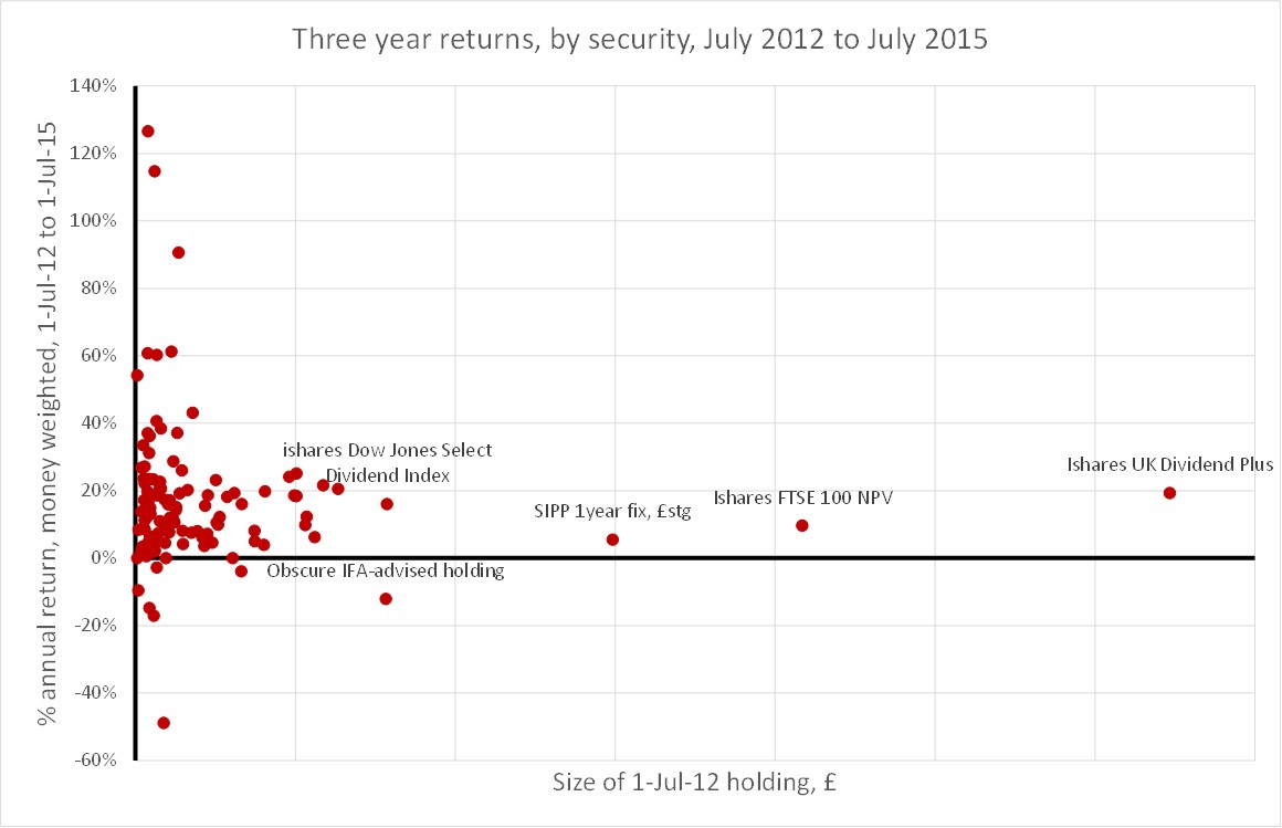
Points that I notice from this breakdown:
- The average return of about 10% per year is hard to see on this graph. But it is there. There is a clear trend that nearly all holdings have made a positive return over three years.
- I lost money on only seven of the 114 investments I started off with. This is a much lower number than I would have imagined.
- I made some dramatic gains – over 50% p.a. – on seven holdings, but they were only small holdings (boo sucks). I will examine some of these investments in a later post.
- My biggest initial holding – IUKD – has delivered 20% per year over three years. Not bad when FTSE-100 has delivered half of this.
- My biggest absolute loss was the ‘obscure IFA-advised holding’ which tells you most of what you need to know about IFAs.
How does this dispersion compare to the anatomy of your portfolio? What percentage of your holdings lose money over three years? What would you like me to explore in more detail?

May i ask what tracking software you use?
LikeLiked by 1 person
@Amit – Tracking software is a sore point. I very cumbersomely use an old version of Quicken 2004. Newer versions won’t work in the UK unfortunately. It is a pain as it involves a fair bit of manual entry. But it comes into its own for these sorts of analyses
LikeLike
I too use Quicken 04 and worry about the day when it stops working. I would love to find a replacement but don’t seem able to find anything as good. Great analysis. Enjoyed reading it.
Paul
LikeLiked by 1 person
Fascinating to see and some excellent returns – congratulations! For myself, I use a simple spreadsheet and monitor prices purchased, dividends received (and then reinvested) and then have to manually do the calculations on where I am. Right now its not pretty reading – from my mad cap decision to invest in some insane AIM stocks (down between 50 and 60%), the crash in Russia (ooops) and the oil reductions (give it time I keep telling myself) – the FTSE is definitely beating me right now this year, which isnt good.
I’ve recently decided to get much more critical – I track each of my streams of investment (ISAs, Pensions, Savings & Mortgage) on a monthly basis so that I can really start to nail in on where I can improve things – I may well end up just drip feeding monthly amounts into my ISA into an ETF!
LikeLiked by 1 person
I use a software called Fund Manager from Beiley. It’s a pretty steep learning curve and manual entry, but once you have things set up I think it works well. Especially if you don’t trade too often. They allow a trial period on their site. It meets all my, simple, needs and much more. I use the most basic version.
LikeLiked by 1 person
@Dave – thanks for the tip. I’ve been checking Fund Manager out. Are you a UK investor or a USA one? I couldn’t see any UK brokers on my version. Annoyingly, though I use Interactive Brokers, Fund Manager only supports it in its Professional Version (and not necessarily for file imports).
LikeLike
[…] the 100+ investments that I can track in detail*, half a dozen made annualised returns of over 60% from 1/7/12 to […]
LikeLike
I use Moneydance to keep track of things, although I also do a lot of manual entry in it; I think it’s possible to have it more automated but last time I tried it didn’t work well with UK data sources. I also have pretty minimal requirements for reporting etc, and nowhere near your number of investments. Still, it might be worth a look just in case it would do what you need.
LikeLike
[…] is the third article examining the 100+ investments that I can track in detail*. Four significant investments made annualised returns of -10% per […]
LikeLike